
That’s right! Both! It’s both Spanish AND graphic design class. But, I’m only certified to teach one of those things, and without Canva, my graphic design skills are like…
Thanks to my colleague Neysa for letting me bounce some ideas around, I started playing around with using infographics as a way to assess presentational and/or interpretive communication through infographic creation. And now this assignment is a staple in a unit planning framework I’ve been working on. BTW, French teachers, check out Neysa’s book Les Découvertes incroyables over at Wayside
More on that unit planning framework in a future post, but if you check out next week’s episode of SLAyyy (Episode 20 if you can believe it!)I briefly explain give an overview of what I’ve been playing around with..
An aside: Huge shout out to Ben and Bryan for joining me on this SLAyyy ride, it’s been so much fun!
Why Infographics?
Creating infographics gives students the opportunity to produce language, for sure. But it can also be an opportunity to really put effort into demonstrating comprehension without producing any new language.
I’ve used infographics in Spanish 1 and Spanish 4, with tasks ranging from visualizing a class story to creating a film critique infographic.
In Spanish 1, I direct students to copy and paste a class text and creating a design that would help other Spanish learners understand the text. It has seemed to be beneficial to have multiple texts for students to visualize,
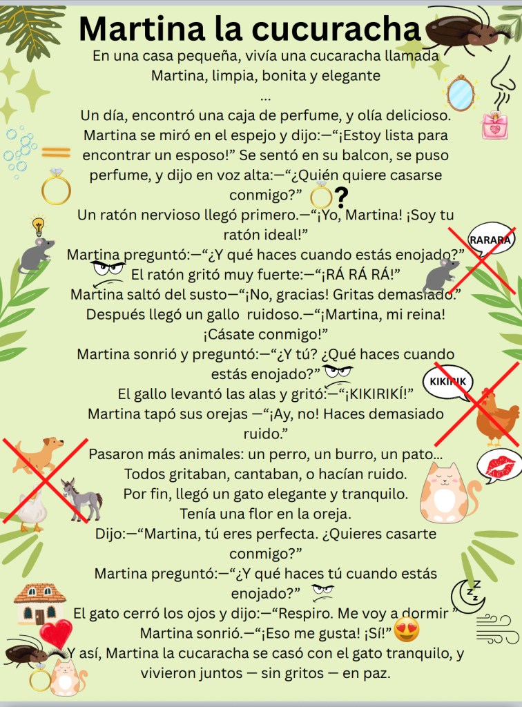
Additionally, if the goal is to create something that would help other language learners, I want to make sure that the product helps language learners. For example, the last unit for Spanish 1 this year was about a variety folk tales from the Spanish speaking world. We learned 6 folk tales in all, and for review week we needed to review all six stories.
After making sure that at least one student would be illustrating each story, students got to decide which story to illustrate. Students copied the text of their chosen story from Canvas to Canva (is Canva just the singular form of Canvas? Something to think about… Something to ponder…)
If a student wanted to work with story A because it’s the easiest for them to understand, great! They’ll get a lot of input because they have to make sure they choose images that CLEARLY illustrate the story.
Once students submitted their infographic illustrations, we looked at everyone’s infographic to review. Having a variety of stories to review, and multiple students’ work to show off made it really easy to read, read, and re-read our class stories! Additionally, having the graphics allowed me to point to images and ask students to produce word or phrase-level output with text support if needed.
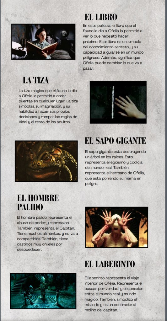
In Spanish 4, students have created infographics to analyze the historical context, cinematic aspects, and whether the events of Guillermo del Toro’s 2006 masterpiece on the horrors of the aftermath of the Spanish Civil War Pan’s Labyrinth were real or if it was was a figment of Ofelia’s imagination.
For this infographic, students chose one of three resources: a video, or one of two articles. Their goal was to highlight what they felt was a strength of the film. Since I was planning on assessing student comprehension rather than production skills, I emphasized to students that they should summarize or simplify (i.e. scaffolded production) the ideas from their resource, but the real sign of comprehension would be how clearly they can illustrate key points from their article. And that, in my opinion, is what makes infographics work, especially in a proficiency-based classroom. They don’t require long sentences to show comprehension. In fact, they don’t require language production at all.
Throughout the creation of the infographics, students are processing content and organizing it visually, often in ways that go beyond what a short paragraph could capture. That makes them especially useful after a content-rich unit or texts that invite comparison or review.
Infographics have become one of my go-to tasks when I want students to apply what they’ve learned in a way that’s clear, purposeful, and open-ended enough for differentiation. They’re not about artistry or aesthetics. They’re about organizing meaning. So while I AM interested in what students come up with to visually represent what they’ve read/viewed/heard, what’s most important is that students show they can understand a text so well that they could find the most important points of a resource and organize their infographic in such a way that represents their comprehension while also being able to share their ideas with others clearly.
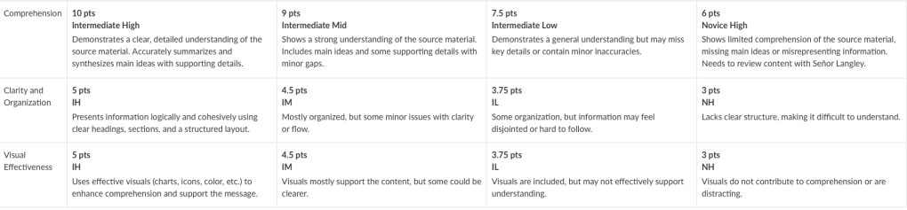
Here’s the rubric I’ve used. Again, shout out to my colleague Neysa for talking me through the creation of this, I think it’s been quite successful, and a lot of fun!

Leave a comment